


HARMONY MOVING
After hearing the troubles a friend went through during a recent move, I decided to have a look for myself. I immediately hit a road block when I discovered was that it was very difficult, if not impossible, to even get a quote.
TWO PRONGED APPROACH
USER INTERVIEWS
In order to gain a full comprehension of the needs of people moving, we needed to conducted interviews with a number of people who had recently been involved with a move
COMPETITOR ANALYSIS
We also needed to understand where competitors weren’t meeting the needs of the user as well as develop an understanding for pre-existing patterns..
USER INTERVIEWS
In order to understand of the needs of the potential user, we conducted scripted interviews to asses the pain points and needs of the user. I spoke with a broad range of subjects including those who:

Recently moved
Helped with a move
Moved with children
Moved locally
Worked for a moving company
COMPETITOR ANALYSIS
We looked at the top 3 Google results for local movers, as these are the most likely competitors in the area. It was a surprise that several of the more mainstream companies weren’t higher on the list. In addition to the 3 listed to the right, we also looked at U-haul and College Hunks.

Almost every website promised a guaranteed price with no phone calls, emails, or in person visits.


What we uncovered was that after entering your personal information, phone calls and/or consultations would be required.

(CJ was cute, but I don’t think I’ll be calling him back)
SYNTHESIS
Going back to the user interviews, we organized all of the stated needs of the users and grouped them by commonality.
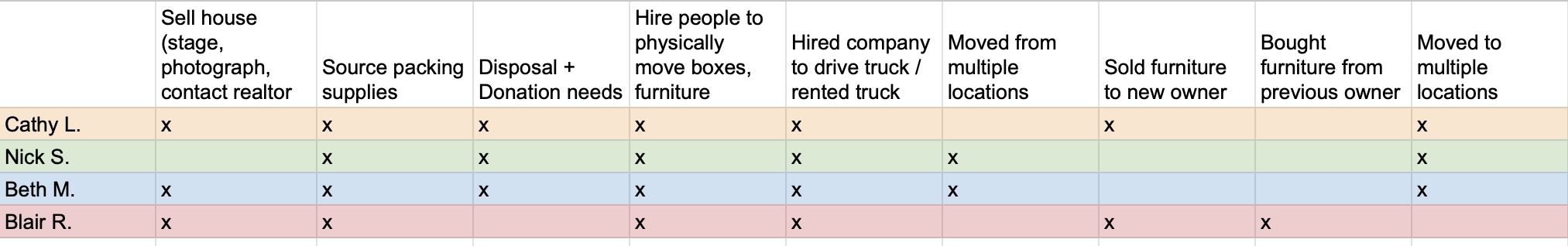
FEATURE SET
We created a feature set to determine the most necessary aspects of the app moving forward. These features are direct reflections of the users needs as taken from the interviews.
The users most common needs:
Packing supplies
Donation + Disposal
Movers + Truck

PERSONAS
By distilling the specific needs of the user down into personas that span the spectrum target demographics, the essential features come into focus.
Dave, The DIY Dad represents middle aged families who need to move to larger homes, but have their hands full.

Vicky, The Volunteer is a younger person fresh out of school who needs to move frequently and needs to stay on budget.

PROJECT GOALS
After establishing the needs of the user, it is crucial to balance the business and technical sides. How will the app generate income? What other metrics of success should be considered?

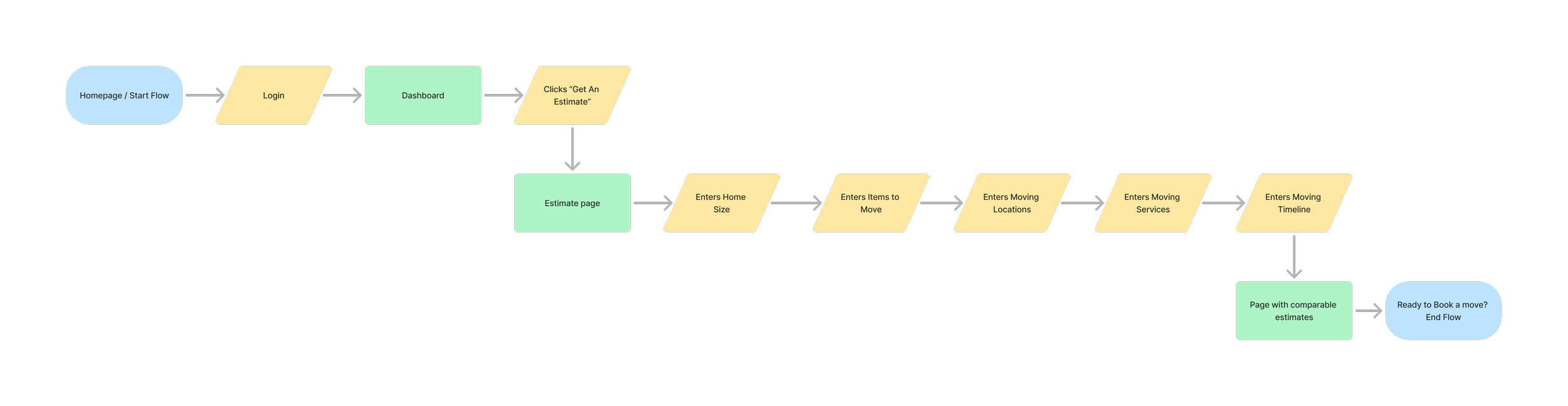
SITEMAP
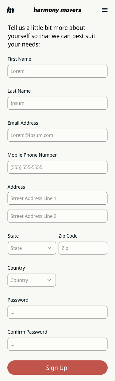
The backbone of the app is to get a quote. If users are able to easily get a quote and control variables, they’re much more likely to stick with the app all the way through planning a move and ultimately making a purchase.

USER FLOW
The most important task flow is to get a quote. All of the additional functions of the app stem from this essential task.
WORKING THROUGH FIDELITY
LOW
I had a rough idea of what I wanted to create, but didn’t necessarily have an idea about how components should be spaced or where they should be placed.

MID
Things are starting to shape up here. I have a much better idea of orientation of buttons. Accessibility and ease of use is a top priority for button placement and field size.

HIGH
Colors are introduced here, fonts have been finalized, and the work is getting polished. Colors are all AA accessible, and AAA when possible.

UI RESEARCH & COMPONENT LIBRARY
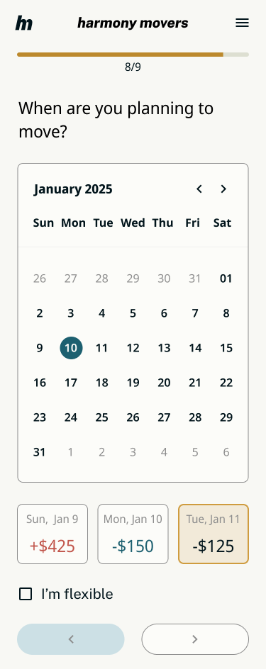
We studied pre-existing patterns that users would be familiar with for calendar use. Websites like Expedia and Travelocity depend on good calendar UI for date selection. I also wanted to show the relationship of date and price.
INSPIRATION
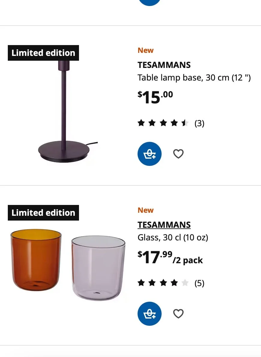
HARMONY UI
The clear, precise labeling of Ikea’s UI was a big inspiration for the cards that help select services. I dug through a number of e-commerce sites, but found this to be the cleanest.
INSPIRATION
HARMONY UI


The component library is based off of the brand identity. I wanted the UI to embody calming, assuring, stable and energetic characteristics.

THE APP ITSELF

A look at all of all that UI put together.

USABILITY TESTING
I needed to know if users found the process of getting an estimate intuitive. I conducted a series of moderated tests to see how the flow actually worked out. Specifically, I was looking to see if users:
spent substantially more time on one page than others
could easily follow the flow without
could actually get a quote

WHAT I LEARNED
Users were able to follow the task flow very easily. The stepper was a big help for connecting the user to the amount of time it would take them to complete the task.
I also learned that there were a few points where the design could be improved.

ITERATIONS
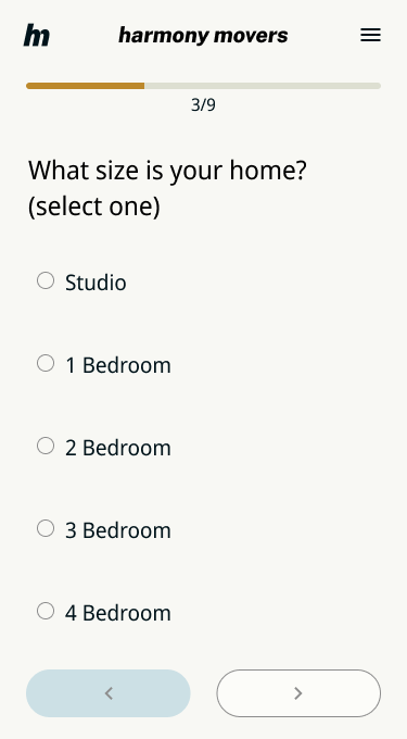
One major piece of information that came out of the usability testing was that people didn’t understand the “quantity of belongings” page. Many users commented that it was a subjective way of determining an objective quantity.

Initially the form came from research into a design pattern that I found on a competitors website


I followed a similar idea, but changed the format from a drop down menu to a radio button. .
“How do I know what to put here?”
After 4/5 users commented on this particular page, I knew something was up. I split the form into two pages to help guide the user and added in clarifying language.

IF I HAD MORE TIME…
Exploring more iterations of the “quantity of belongings” page would be highly valuable. It is a competitor weakness that seems to be critical to the needs of the user.
