

Chicago Clay Co-Op
Personal Background

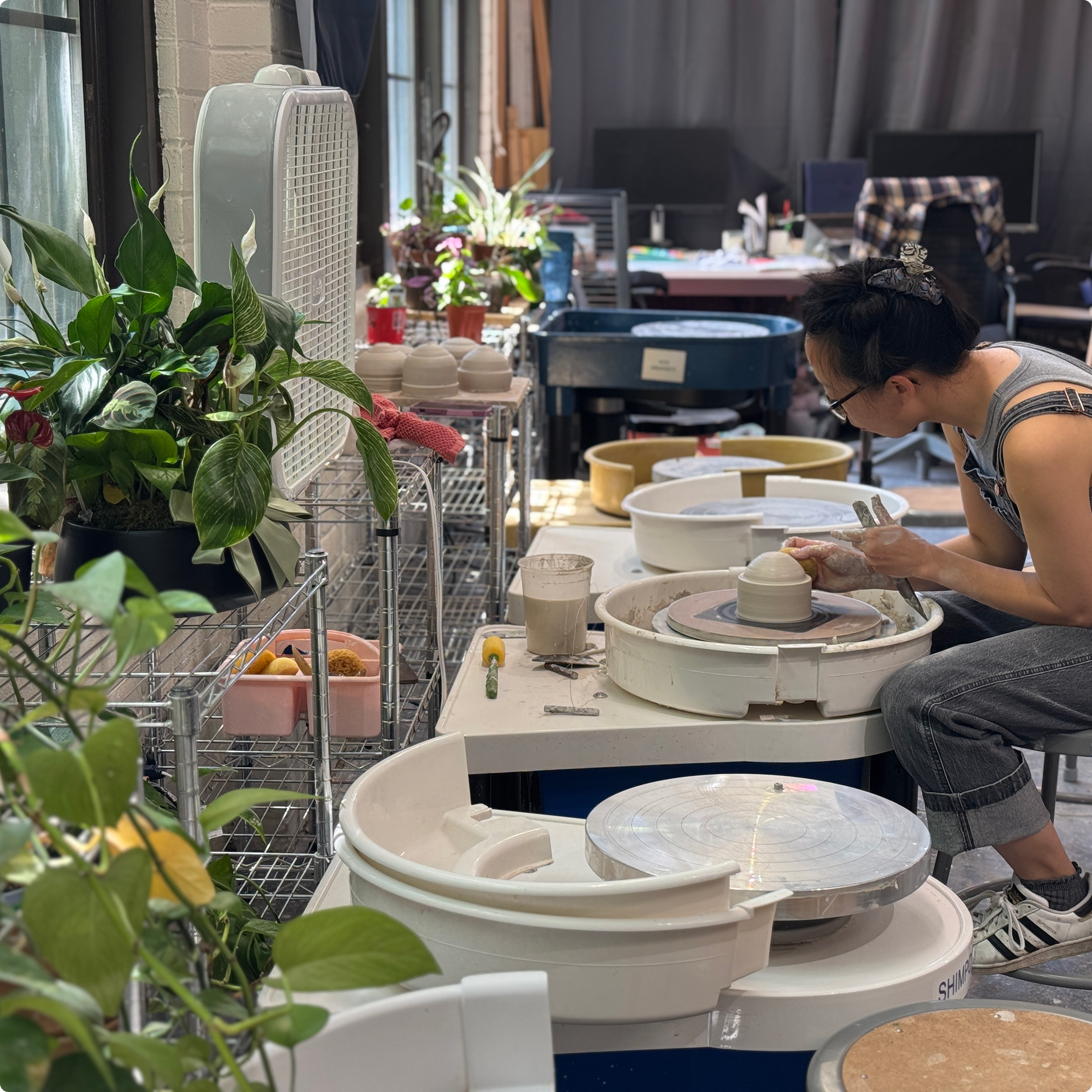
In February, I moved into a new ceramics studio, The Chicago Clay Co-Op. The space is home to two dozen artists and hosts regular events and workshops.
Problem Statement
The Co-Op hosts a number of unique one day workshops and a quarterly rotating gallery show. The space is in the back of an old industrial building in Chicago, so it doesn’t get a ton of foot traffic.
How might we help visitors have a seamless desktop and mobile experience when coming to a workshop or show?
Approach to Research
Because the events offered at the space are not the traditional “classes” that you might find at other ceramics studios, we needed the research to focus on a broader spectrum of events. We looked at a variety of event spaces that offer diverse one day events across multiple age ranges.

Sleeping Village is a concert venue that also hosts a number of free events. I found the information hierarchy to be a bit unbalanced.

The Nature Museum did an excellent job at letting the user know exactly what to expect and who should be expecting it.

The Botanic Garden offered a variety of activities from current blooms to dining options in a “Plan Your Day” page. It lacked filters such as “paid options” or “ok for kids” etc.
Interviews

I interviewed a group of people about how they might plan a visit and what the most important aspects of planning that visit were to them.
Patterns
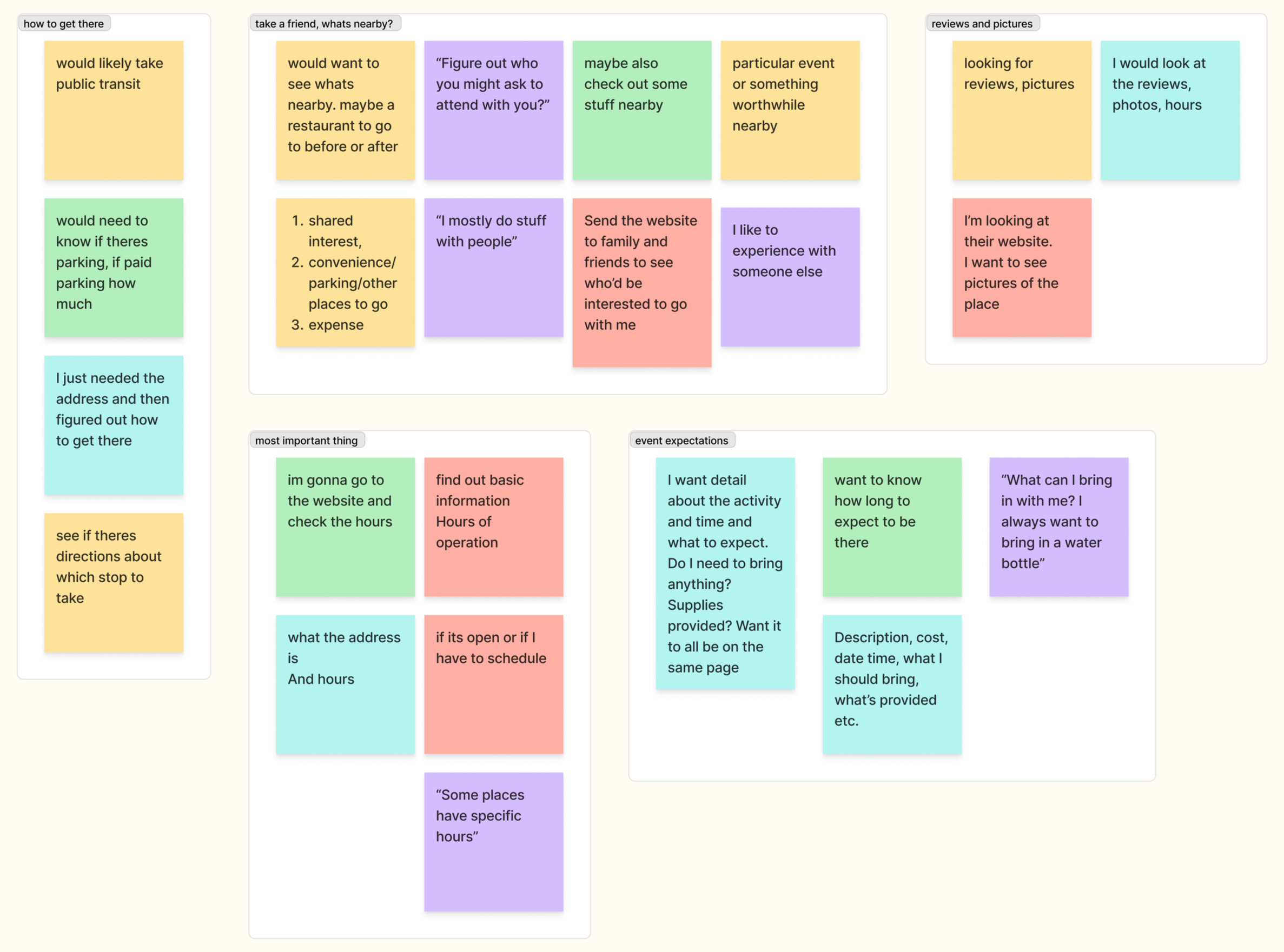
The most common patterns that emerged were that visitors needed to know:
Description of the event (including reviews and photos of the space itself)
Date and time
How to get there
What to bring / what is provided
What else is nearby
An easy way to send to a friend
Feature Set
With the interviews guiding the way, I constructed a feature set for the website. Most of the information mirrored flows that were present in my event space research, but having a mobile-forward share button would really be a key differentiating factor.

Site Map
I included some down the line needs and secondary wants in the site map, so that as the business grows, theres a framework for their needs in place.

User Flow
The user flow is fairly simple. There are some additional needs that are nested in a lot of these pages that aren’t necessarily part of the flow ie “send to a friend” or “what can I bring with me?”

Inspiration
Because the business is located in an art deco manufacturing building, we wanted the UI and logo to reference the industrial history of Chicago.
We researched a number of famous businesses that were based in Chicago at one point or another.
Some of the names might be familiar, but the logos have certainly changed over the years.

We loved the Foley’s tin as well as the combo of serif/sans serif fonts in their packaging. We took a lot of inspiration from the Zeno chewing gum dispenser in terms of font selection and palette. The black and yellow really pops in a way that ties back into the buildings industrial roots.

Low + Mid-Fi
Before proceeding further into the design process, I reviewed the user interviews to see how people were looking for events.
I had initially planned to implement a calendar, assuming that most users would search for an event by clicking on a specific date.
Only one interview mentioned starting with a calendar-instead, most users stated that they would begin by looking for a specific event on the website.
“I would go to the website and click on [the card for] the specific event.”
I took a step back and thought about some recent concert experiences that I’d had. A local concert venue laid their events out as cards placed in chronological order.
The events were the calendar.
This resonated with me in relationship to attending an event. It would also be easily adaptable to a responsive design.

I drafted out a few quick ideas for how that idea could be implemented in the Co-Op’s website.
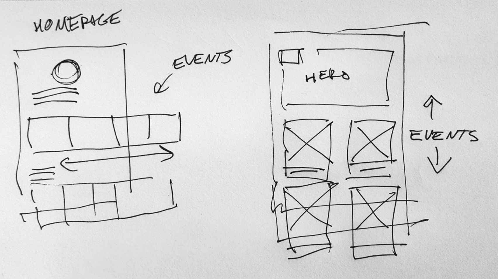
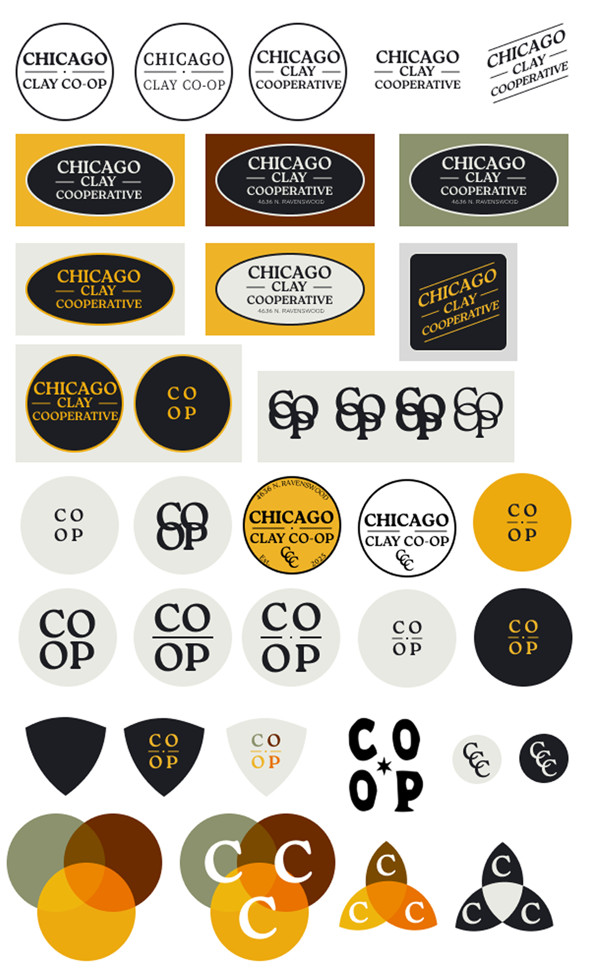
Logo Exploration
We worked through a number of iterations of the logo before settling on a simple round logo (seen below).

Style Tile
All of our colors are tied back into the vintage branding research we did, including the blend of serif + sans serif fonts.

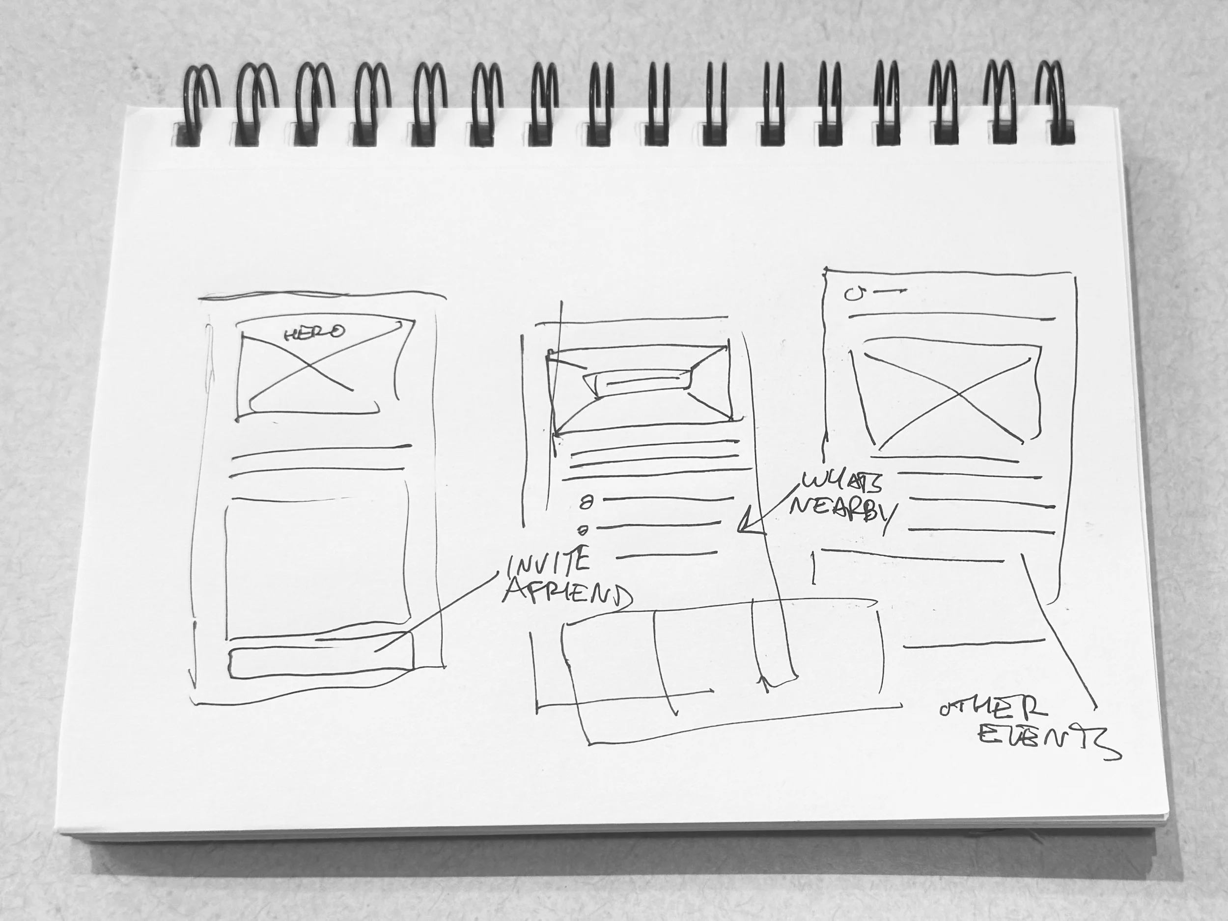
Mid-Fi

As stated in the initial series of interviews, the primary needs of the user are to:
Find and book an event
Get directions
Bring a friend
I conducted a series of interviews where I asked users what information they valued when performing those tasks.
The answers gave me a clear direction for the hierarchy of the cards.
Almost all of that information is distilled into the workshop cards. If the user can get to the workshop card easily, then all of that info would be at their fingertips.
I focused most of my time and energy at the mid-fi level in getting the hierarchy and flow for the workshop cards to feel intuitive.
Ultimately, I wound up settling on a more neutral feel for the page before conducting my next round of testing

Testing
I conducted a series of interviews where users were asked to complete the 3 primary tasks.
There were no hiccups with any users.
I know that doesn’t make for a compelling case study, but I didn't have any issues, so I decided to refine the design and dig deeper.
Refining
I adjusted a few colors and adjusted up the logo. I wanted the overall feel of the website to be simple and clean.
One of the changes that I made at this point was adjusting the copy of the menu from “Events” to “Schedule” since it includes everything that happens at the space. The intention of this change was to clarify what to expect on the page.
More Testing
I wanted to get specific since I already learned that the flow felt intuitive from the home page, so 3 tasks were set up:
Register for a Weekday workshop in the afternoon in September.
Get directions to the space as if you were planning to take the Metra.
Share the event with a friend starting from the schedule page.
Results
The only thing that tripped the users up was the use of the word “Schedule” instead of “Events.
“I don’t know if its under Visit or Schedule”
“I wanted to see an events tab, didn’t think to look at schedule”
If it ain’t broke, don’t fix it.
I changed “Schedule” back to “Events.”
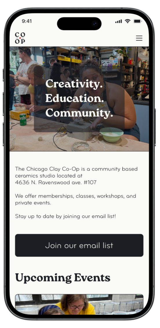
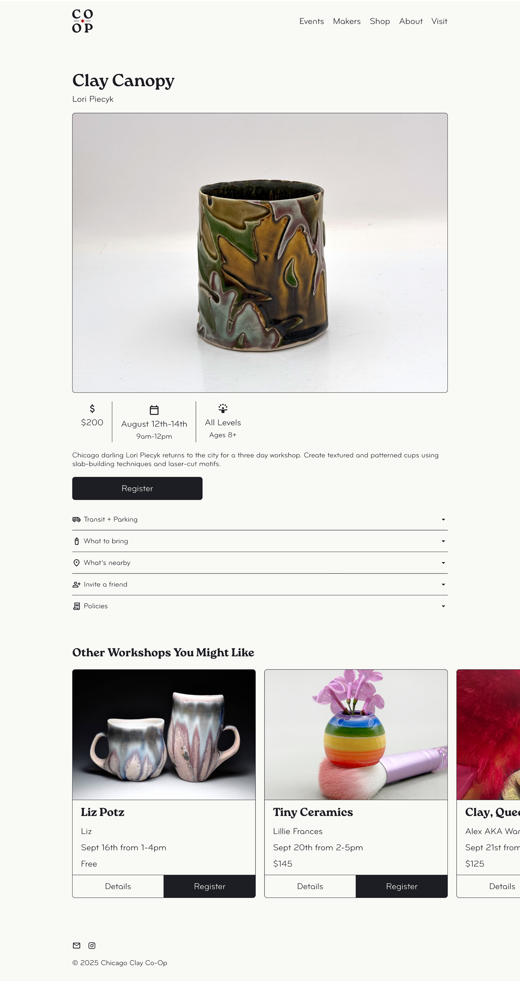
The Website
The design was built to be easily accessible on mobile and desktop. Here’s a look at the homepage.
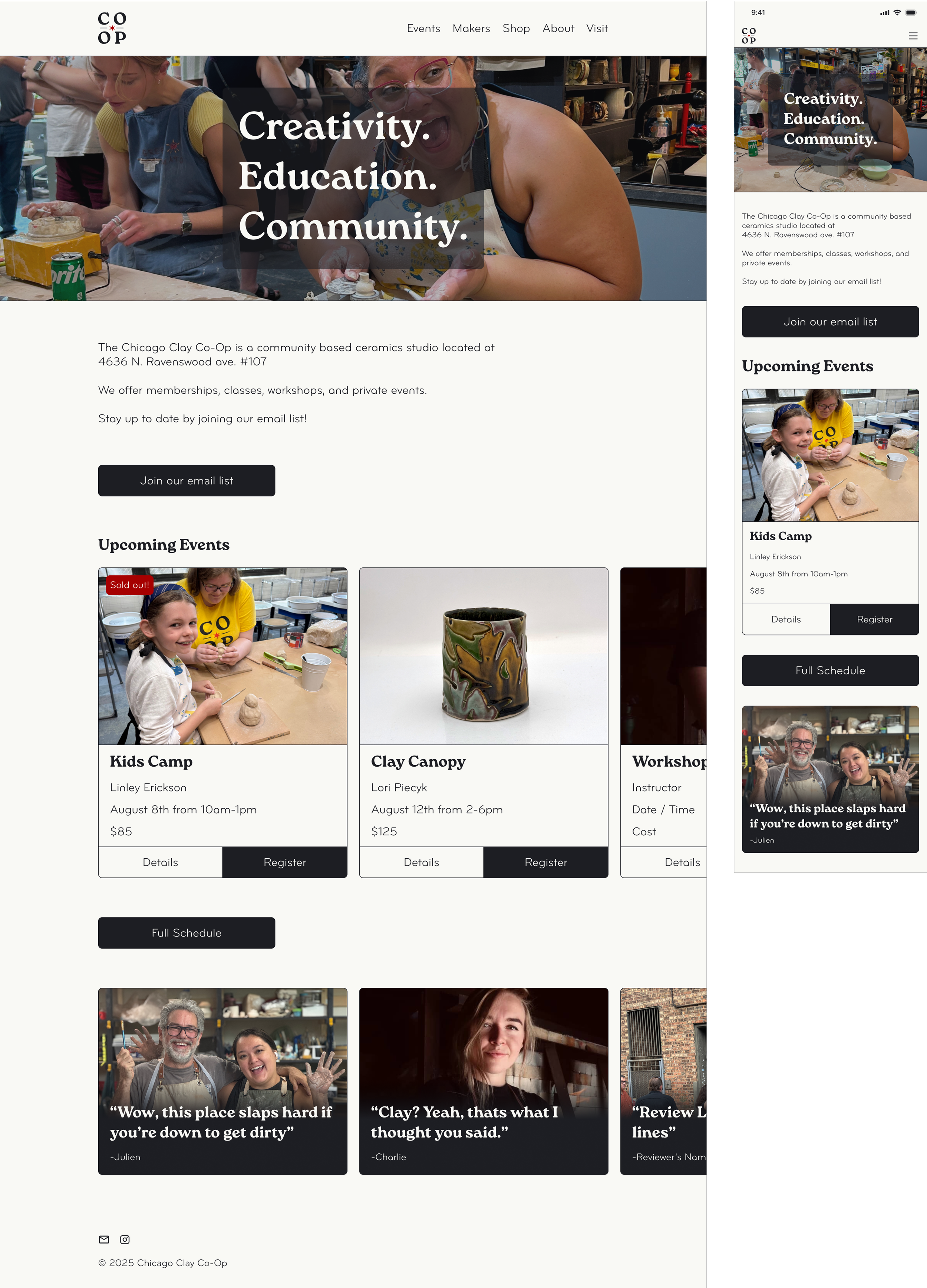
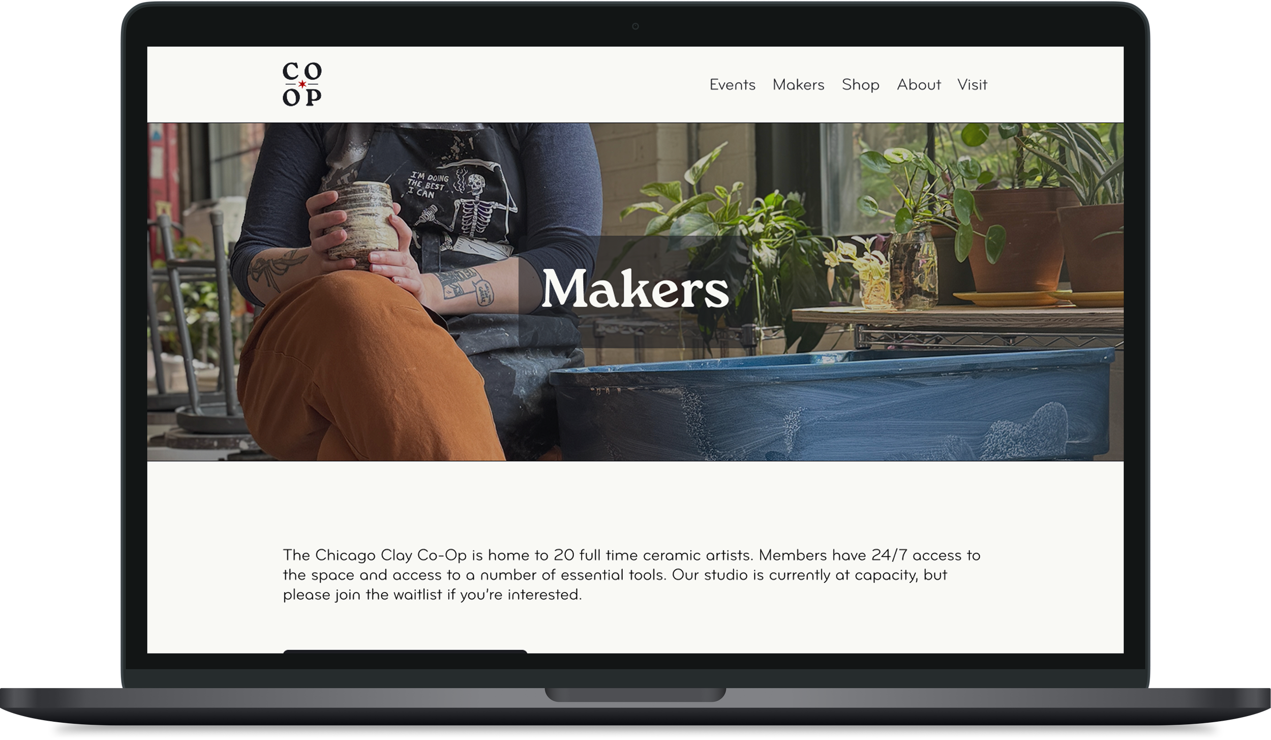
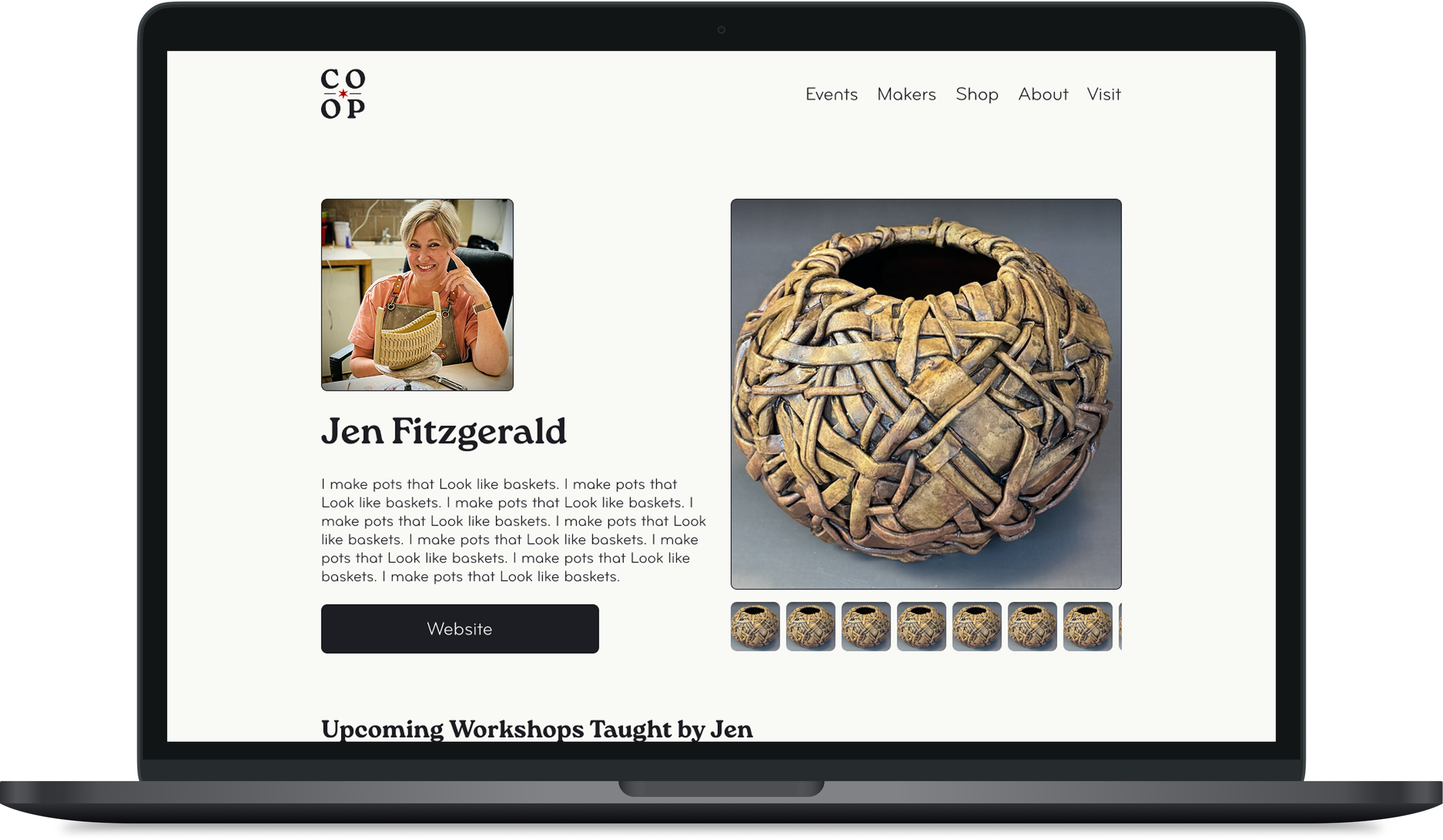
We wanted a way to highlight the members and encourage traffic to their personal sites as well.
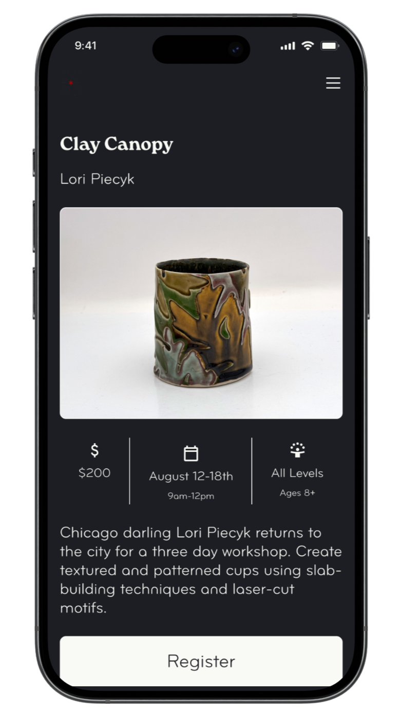
The specific workshop page with the “Directions” tab opened.

Next Steps
P.S.
One of the users had their phone set to “Dark Mode” when testing, which rendered some of the buttons nearly invisible. I’d love to address this down the line.
I worked with a fellow Co-Op member who’s also a software engineer to build the website. It’s functional and we regularly update based on feedback we receive from guests.
If you’re interested, have a look!
Have a look at some of my other UX projects:
A streamlined reimagining of Etsy’s listing flow for sellers.
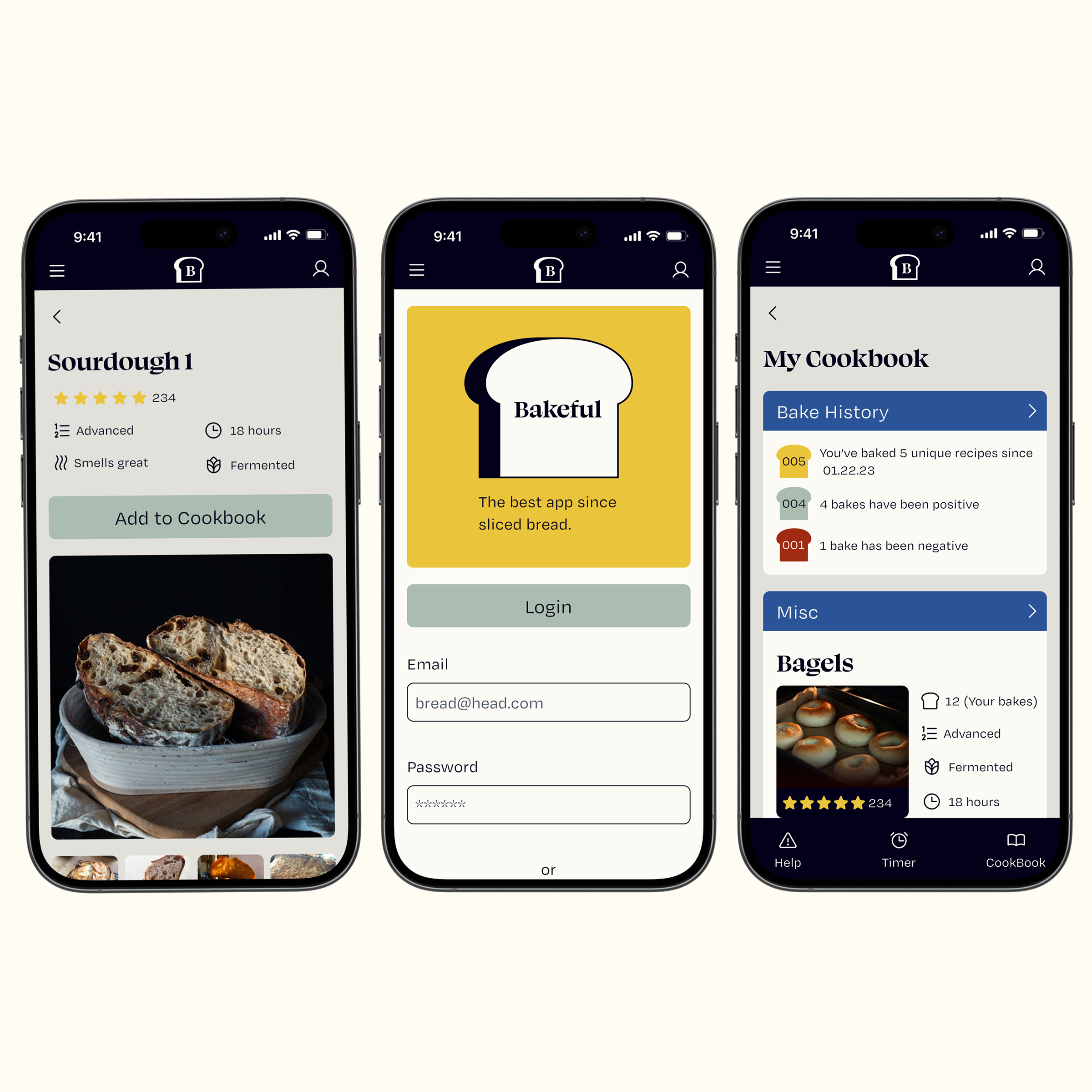
A mobile app to track baking progress for novice and experienced bakers.