Etsy Templates
Personal Background
Over the past several years, one of my major creative outlets has been practicing ceramics. I was drawn to the tactile nature of the medium as well as the ability to blend functional and sculptural elements.
I started selling work on Etsy in 2019 as a way to fund the hobby. At the time, the platform was primarily geared towards artists and craftspeople. I met a community of peers who helped to guide my practice.
Problems with listing multiples
Etsy has an active community of people who help each other troubleshoot problems. I kept having issues with my listing process.
It is very difficult to post multiples of similar but unique items. The seller has to manually re-enter the same information repeatedly for each individual listing.
Initial Research
I did some digging on the Etsy communities and a number of other users had similar issues.
Several people suggested a workaround: duplicate a fully complete listing.
To me this felt counterintuitive, redundant and highly likely to generate accidental posts.
Etsy also encourages the user to post variations, but this doesn’t solve the multiple, unique listing issue.
So...
How might we help Etsy users to reduce the redundancy and turn a workaround into a feature?
Diving Deeper
After confirming the problem through an initial round of internet research, I got more specific with a series of interviews. I spoke with sellers who had a range of experience levels. The only criteria was that they all create multiple OOAK (One Of A Kind) items.
Personas
I developed two personas that exemplified the needs of the various users that I interviewed. Essentially there were two categories of user: Novice (Stacy) and Expert (Hank) with their own sets of needs, pain points and perspectives.
Full Perspective
Organizing the needs of the seller, buyer, and business began to highlight a possible solution. Generating more listings would not only help optimize SEO and drive buyers to the site, it would save time by not having to scroll through options within individual listings.
A Hunch
At this point, I felt that I had a pretty clear direction for a feature that could redirect the frustrating patterns that the users were facing.
The basic idea for the feature is to allow the user to create a template that has most of the required information already filled out. From there, all they would have to do is add pictures, change any details, and publish the listing. The templates would live in a separate tab, so accidentally posting a previously made listing wouldn't be an issue.
The feature would be called Templates.
Placing the Feature
There are two key aspects to the Templates feature:
Creating the template
Creating a listing from the template
The first step was to map out the existing user flow that the seller would take to publish a listing
Next I placed the new flow for creating a template into the pre-existing flow.
Then it was on to the second aspect of the feature-I needed to map out how the user would access templates to publish a listing once they were created.
Low-Fi
Now that I had an idea of what I needed and where it needed to go, I could map out what those pages might visually look like. They needed to reference Etsy’s existing UI while still feeling fresh and new.
Mid-Fi Feature Testing
Before spending the time to bring everything up to Hifi, I put together a simple draft of the key frames of the user flow and reached back out to my interview subjects to see how they felt about the flow.
Due to time constraints, I conducted unmoderated tests where the subjects followed a pre-populated flow and filled out a questionnaire afterwards.
Responses
Overall, the feedback I received from the midfi tests confirmed that there was a need for this template.
I also needed to confirm that the flow itself was intuitive and matched the pre-existing style that Etsy had established.
The idea of premade templates could potentially save even more time and streamline the business side of things as well.
“I’m very into the idea of being able to create my own templates, and also browse pre-made templates on Etsy”
Now that I had data supporting the Templates feature, it was time to put together a UI kit.
Despite having a very simple outward appearance, the UI utilizes quite a range of neutral colors. I'd imagine this is something leftover from a number of updates over the years. I think that if I could get in there and simplify it, the appearance would be much more streamlined.
Hi-Fi
The fonts were a bit simpler. Georgia and Droid Sans were the closest available fonts to what Etsy actually uses. There are minor differences, but nothing that makes either of these feel noticably out of place
A large portion of the Templates feature revolves around simple data entry fields. I mirrored the existing UI and streamlined the placements.
In addition to mirroring Etsy’s UI, I had to create a few new things. In order to have a similar feel, I referenced preexisting components.
Key Frames
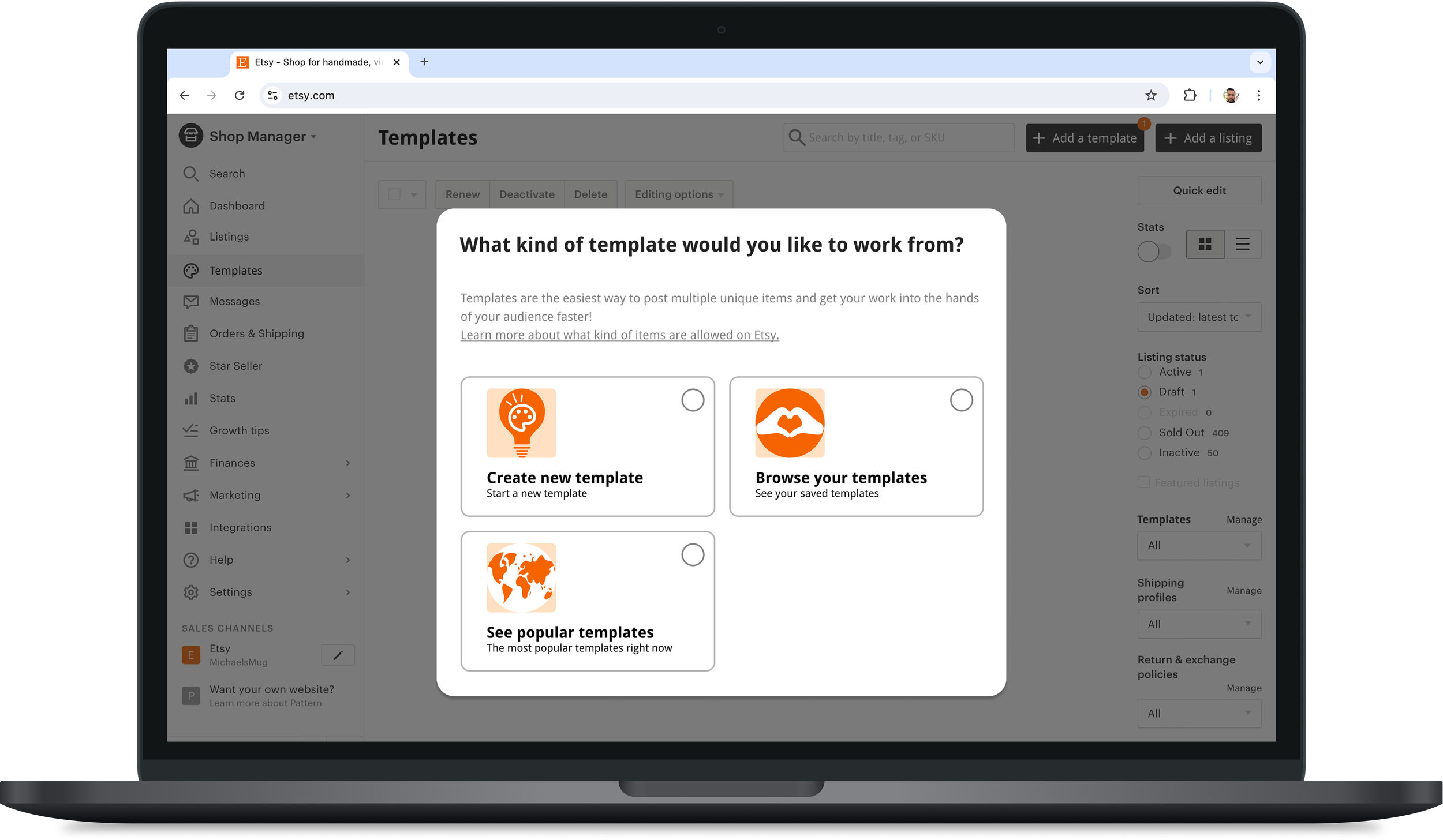
Here are a few Hifi key frames I created that show the updated process. This first frame is the template selection window that pops up when the user creates a listing from new a template.
A glimpse at the refined templates flow. The updated step wizard shows the user exactly where they are in the flow. This is the “Details” page.
How “Templates” would show up in the dashboard. There’s also a category for “Popular Templates” that are pre-existing templates that Etsy has published for sellers to utilize.
Once a template is selected, there are only 3 required fields to complete (including adding photos and a video.)
This effectively reduces the preexisting flow from 19 required fields down to 3.
Final User Testing
To confirm the flow was working properly at Hi-Fi, I conducted a series of moderated tests.
Every user was able to navigate through both tasks with ease, but there were a few areas with room for improvement.
“I want to close out of all of the pop ups first! I know the policies already - I don’t need reminders!”
First, I got rid of all of the Pop up windows. They were creating noise and distracting the users from the flow. Maybe there’s a better place for this information somewhere else.
“I’m seeing the stepper, but its not super clear”
I added in a stepper with more color to draw the attention of the user.
Before:
After:
“I want to see what the listing is going to look like before publishing
Lastly, a number of users tried to preview while the button was inactive. I addressed the active and inactive colors to make the selection more direct for the user. This is the quickest solution to the problem, but is ultimately not a fix to the user’s issue.
If only I had more time…
Making the active and inactive states of the buttons clearer is more of a band-aid fix to a larger problem:
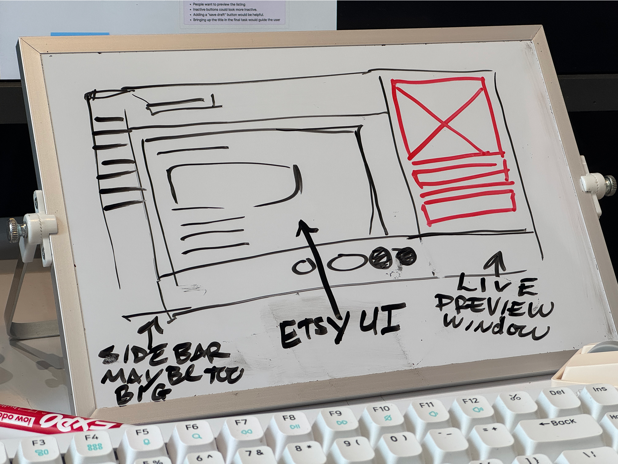
Users across the board wanted to preview the listing throughout the process.
I’d love to create a preview window that updates live as the user updates the template or listing.
Have a look at some of my other UX projects:
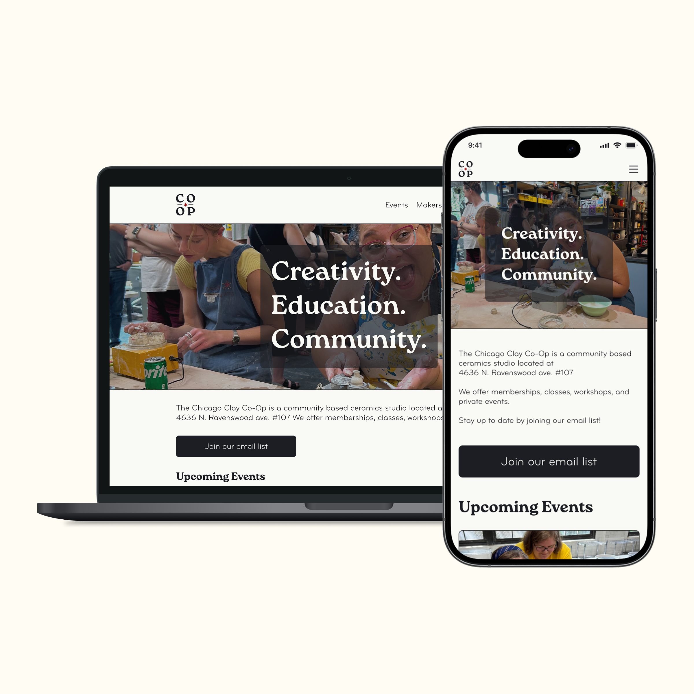
An end to end website project designed for desktop and mobile.
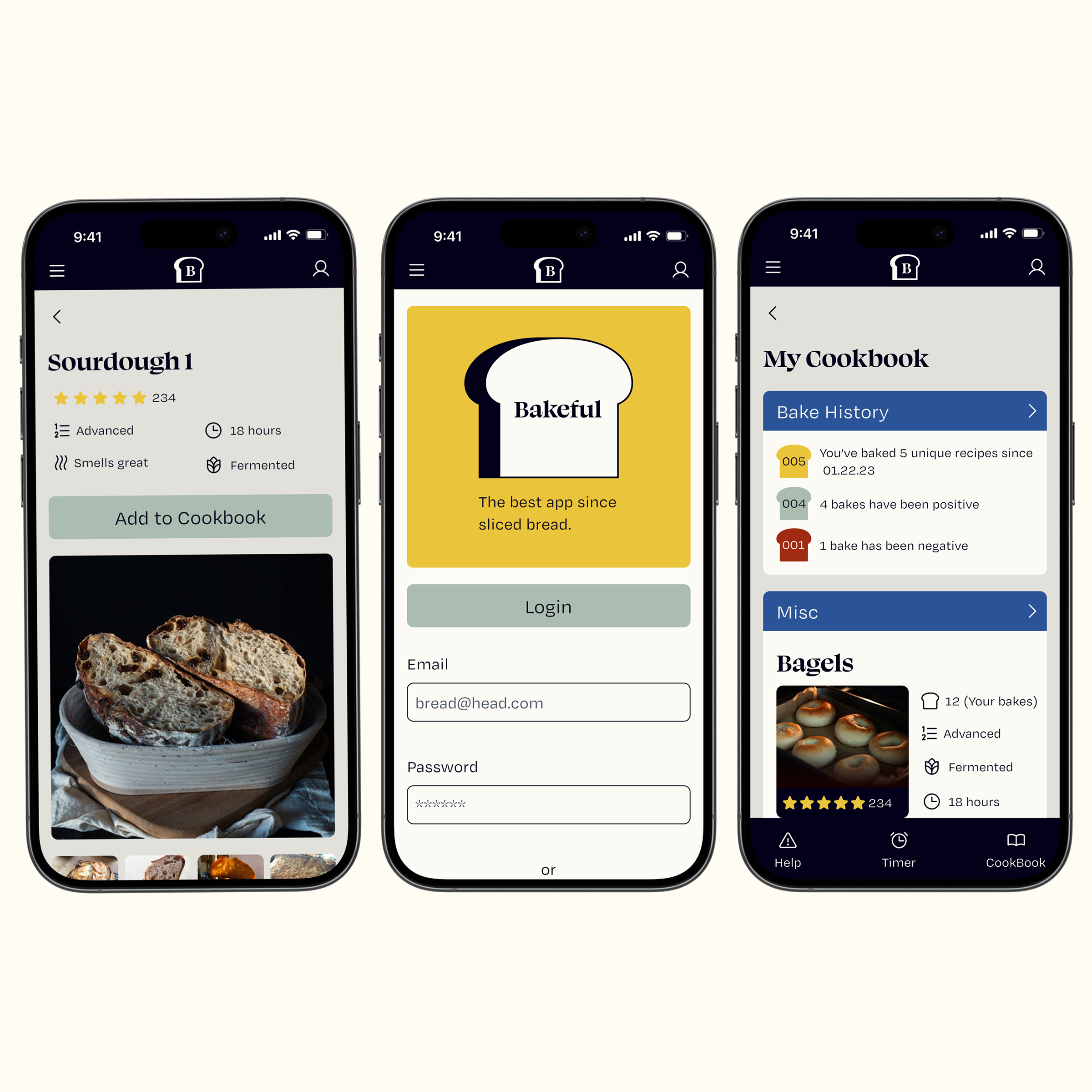
A mobile app to track baking progress for novice and experienced bakers.


